Introduction
Baobao is an early-stage marketplace that connects independent artisans with customers looking for handcrafted bags. Each seller operates with distinct shipping rules, fulfillment timelines, and post-purchase expectations—creating inherent complexity in the checkout experience.
When I joined the project, the business was struggling with significant checkout drop-offs. User reviews on third-party platforms consistently pointed to the same issues: the checkout flow felt untrustworthy, payment options were limited, the process was overly fragmented, and the mobile experience was especially frustrating. These issues directly impacted conversion and revenue at a critical growth stage.
Through deeper product analysis, I found that the problem went beyond visual polish. The existing checkout failed to support users at key decision moments—offering little guidance, poor error handling, and no sense of progress or reassurance. For a small marketplace without strong brand trust, these gaps were especially costly.
Project Type
Marketplace Checkout Experience Redesign
Design Stage
Startup — Conversion-Focused Redesign
Deliverables
Checkout flow restructuring, decision-support UX, trust signals, guided recommendations, cross-vendor purchase logic, responsive experience design
BaoBao
To further improve checkout conversion and user confidence, I introduced several supporting improvements:
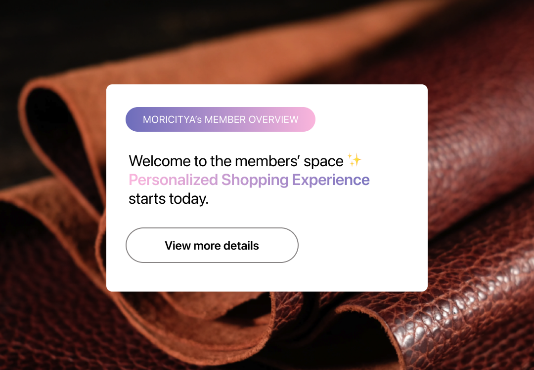
Expanded payment options to reduce friction and accommodate user preferences. Added recognizable payment and security logos to reinforce trust at critical decision points. Introduced contextual prompts, such as in-flow app rating requests, to capture real-time user sentiment without interrupting the checkout experience. Integrated intelligent recommendations to increase engagement and dwell time, while keeping suggestions relevant and non-intrusive.
These changes were designed to support conversion without overwhelming users or distracting from the primary checkout task.
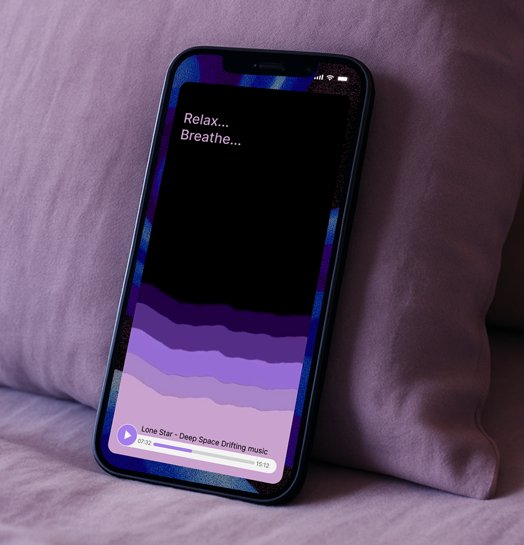
To strengthen both usability and emotional clarity, I designed an emotion–function–style aligned UI color system that supports functional understanding through subtle visual cues.
Rather than relying on explicit instructions, the color palette helps users intuitively interpret states, actions, and feedback—making the experience feel more guided and predictable without adding cognitive load.
In a handcrafted marketplace, purchasing is not only about fulfilling a need, but about seeking meaning, individuality, and connection. This approach allowed the interface to communicate functionality while reinforcing the emotional values behind supporting independent creators.
Highlight — Defining a Sustainable Niche for a Handcrafted Marketplace
Instead of optimizing Baobao for impulse-driven purchases, I shaped the experience around intentional, patron-style commerce, encouraging users to follow and support specific artisans over time. I introduced post-based storytelling and a lightweight subscription model to strengthen creator visibility and long-term relationships. Checkout and post-purchase flows were designed to emphasize supporting craftsmanship over cart expansion, helping Baobao establish a more sustainable and differentiated position within the handcrafted marketplace space.
The Old Endless Checkout Flow▲
vs The New One Page Flow▼

The one-page checkout flow plays a critical role in determining whether users successfully complete the purchase process. By consolidating all required steps into a single, coherent experience, it reduces cognitive load, minimizes interruptions, and helps users maintain momentum toward completion. As a result, checkout completion rate becomes a key behavioral signal for evaluating the effectiveness of this product experience, making the one-page flow a foundational element of the overall design strategy.
Well-timed reminders were used to support user engagement and retention without creating pressure.
By simplifying the overall flow, Baobao encourages users to interact with the app anytime and anywhere—making it easy to complete a purchase even within a few spare minutes.
The combination of a streamlined checkout and contextual reminders allows the experience to fit naturally into different usage scenarios, lowering the mental barrier to return and reinforcing habitual use.
A central objective of the redesign was to increase shopping engagement while reducing checkout effort, optimizing the funnel at its most sensitive stage.
In addition to streamlining the overall flow, I introduced assisted form inputs, intelligent auto-fill, and robust error prevention and recovery to minimize user friction and input failure. These mechanisms ensure that users provide accurate information with the least possible effort, reducing abandonment caused by form fatigue or correction loops.
By shifting cognitive and operational burden away from the user, the checkout process becomes a low-resistance extension of browsing—supporting higher completion rates without interrupting engagement.
Conclusion
This project demonstrated how targeted checkout redesign can directly address conversion loss in a live marketplace environment. By focusing on effort reduction, trust reinforcement, and flow coherence, the updated experience improved completion behavior while maintaining alignment with the platform’s business model.
Rather than relying on surface-level UI changes, the solution addressed systemic issues across form handling, payment flexibility, decision support, and post-purchase clarity. These changes enabled users to complete purchases more efficiently, reduced friction-driven abandonment, and supported stronger engagement across devices.
Overall, the redesign translated product insights into measurable experience improvements—strengthening both user confidence and business performance in a complex, multi-vendor marketplace.
Immediate lift
Impact
After optimizing the live multi-vendor checkout, we reduced shipping-step drop-offs and increased completion and perceived trust by simplifying key steps, strengthening trust cues, and improving error recovery.
-47%
Shipping Step Drop-off Rate
+28%
Checkout Completion Rate
+36%
Perceived Trust Score (post-checkout survey)
Metrics measured on live traffic during rollout; trust based on post-checkout user survey.